8 Signs Your Website Has a Conversion Problem (& Not Traffic)

Imagine that you own a grocery store.
Customers wait for service at empty registers. Products have barcodes but no pricing. In your store, prices are always a surprise at the register, like a gender reveal at a baby shower.
All produce has passed the point of no return. Non-perishables sit on shelves so disorganized that even store employees struggle to find them. No one has been on staff long enough to master the inventory.
Puzzling, isn’t it, that business is lackluster? The store has such a great location!
Maybe you should do what everyone does, and advertise! There’s never a business problem so great that it can’t be solved by specials and a growing awareness of your brand!
Advertising, the Cure-All for Business Ills
Yeah, right. Because until you fix the gaping holes in your store experience, you’ll be throwing good advertising money after bad. Driving new customers to a store that falls spectacularly short of basic expectations is a fool’s errand. You don’t have to be Warren Buffet to see that.
Yet that’s precisely what many business owners do to boost their faltering websites. Even multi-million dollar corporations bungle into the trap. They interpret flagging sales as a traffic problem when in fact, their traffic doesn’t translate to sales. It doesn’t convert.
The Definition of “Conversion”
In web terminology, a conversion is a desired visitor action. It could be:
- A phone call to request service.
- A phone call for a quote or information.
- A completed form, like “Contact Us” or “Get a Free Estimate.”
- A purchase, in the case of an e-commerce site.
- A visit to your retail store.
Why Prospects Don’t Covert
Does your site have a high bounce rate? Would you know if it does?
A “bounce” occurs when a visitor lands on your site and leaves without further action. It’s analogous to a customer walking into a store, turning about-face, and exiting empty-handed.
Some factors contributing to a bounce may be outside your control.
- The visitor may reside in Hyderabad, India, 8,000 miles outside your service area.
- The visitor may be browsing casually and not looking for a service or transaction.
- The visit may come from a competitor who’s checking you out!
However, a poor website experience always correlates to a higher bounce rate.
Have you looked at your site through the eyes of a customer? Is contact information easy to find? Do you offer the right messages and assurances?
The Shortlist of Conversion Killers
Some conversion non-starters are:
- Long page load times. 1 in 4 visitors will abandon a page that takes longer than four seconds to load. That full-width, high-resolution, 600K background image on your home page adding two seconds of load time? Nobody’s looking at it except Google.
- Poorly conceived navigation. Can visitors tell at a glance what’s clickable and what isn’t, and where the links lead?
- Murky messaging. Maybe your copy is long-winded and stuffed with jargon — sound and fury signifying nothing. Or perhaps you’ve buried important points in long paragraphs.
- Low contrast or tiny text. Gray text on a colored background may please your aesthetic sensibilities, but it’s hard for the average user to read, and not just people with visual impairments.
- A lack of guarantees, assurances, and calls to action. Wouldn’t you like to know if a repair is warranted?
Why Buy Traffic, When You Should Fix Your Website Instead?
Why then does nearly everyone bolster flagging sales with purchased traffic, typically from Google? Choice keywords might cost $20 per click or more in their industry.
For starters, buying traffic is much easier than fixing UX (user experience) and removing barriers to conversion. Sound UX analysis takes expertise, experience, and wisdom beyond the reach of some web design teams.
And with purchased traffic, the results are immediate. If you spend $5,000 a month on Adwords, you’ll make a sale now and then by dint of traffic volume. The rotten produce will fly off the racks!
Plus, not all UX fixes are easy. To correct slow-loading pages, you may have to optimize and reload graphics, redesign forms, rebuild pages, and in some cases, reconstruct an entire website.
Recognizing the Red Flags of Low Conversion
Take a hard look at your website and current online marketing methods. Are you choking on $20 purchased keywords as your phones gather cobwebs?
These are the reddest red flags of a site that’s not converting visits to sales.
1. You have healthy levels of traffic but little business.
Most small business websites see fewer than 16 visits per day. If you’re getting 100 daily visits on your site, and your conversion rate is 10%, you should have ten daily leads just from the website.
Check your analytics (or have your marketing service do this for you) to see where that traffic is landing. On dead-end pages with no calls to action or call-out navigation to high-value content?
Your blog may be generating more traffic than service pages on your site. Blog pages should offer links to contact forms and service information, as well as links to other blog articles.
Also, if traffic comes disproportionately from outside your service area, you may have a localization problem, or you could be posting the wrong content to attract local searchers.
2. The data show poor customer engagement.
We mentioned bounces as a possible signal of visitor dissatisfaction. Sessions, page views, and time on a page are other engagement indicators.
- More than one session: They’re returning to your site; they may be interested.
- Multiple page views: They’re advancing beyond the home page and browsing the site for information.
- More time spent on a page: They’re reading your copy and marketing messages.
According to Think with Google:
78% of consumers have spent more time researching a brand or product online than they have researching in a store.
While this statistic applies to e-commerce more than information sites, it’s safe to assume that most prospects are researching rival companies in your business area, requesting estimates, and evaluating prices and services. You’re just one of many suitors.
Visitors who don’t venture beyond your home page are often:
- Uninterested.
- Irrelevant, like a visitor from somewhere outside your service area.
- Frustrated by the home page user experience.
- Unimpressed by the message you convey. They’ve seen enough.
Conversely, when prospects spend more time on a page, they’re interested in what it says and may call you at some point or proceed to the contact form.
3. Site navigation is confusing.
Nothing frustrates a visitor faster than poorly designed navigation. An experienced eye can spot it at a glance, but you’d be amazed how common the problem is across the internet.
Unless they’re firmly grounded in UX principles, graphic artists may copy the flawed navigation of competitor sites and pay forward the mistakes your competitors are making.
Among the cardinal sins of poor internal navigation are:
- Links that aren’t obvious, for instance, a text link that’s not underlined or called out by a color reserved for links.
- Arbitrarily colored headings and text that look like links but aren’t.
- Inconsistent use of icons — sometimes for linking and at other times for decoration.
- A lack of internal links on a page. Consider Amazon.com. When was the last time you relied on global navigation? Some people use links within site copy almost exclusively.
- Designing for desktop only and not for mobile. If you place your contact form on the right rail of a long page, mobile displays will push that form to the bottom. Mobile accounts for more than 50% of traffic on most sites.
4. Your copy is confusing or just plain dull.
Does your copy read like a poorly written Wikipedia page? That approach may resonate with search engines but not with customers. Chances are, the search engines will hate it too and respond with lower rankings.
Why are prospects coming to your site? What are they looking for? Are they browsing at leisure or hurriedly from a mobile device?
- Remember WIIFM: What’s in it for me? Don’t try to impress with your encyclopedic knowledge of a subject. Let prospects know what you can do for them.
- Write for pace. Your copy should have a brisk tempo. Make your points quickly.
- Frontload essential points. No prospect reads an entire page of long copy. Not even this page.
- Make copy scannable with bullet points, short paragraphs, and plenty of headings.
- Review your copy for readability. Flesch Kincaid Grade Level Readability checkers can help. Aim for an 8th-grade level or so.
5. Your site lacks clear calls to action.
What’s the purpose of your website?
Make it clear to prospects which action you want them to take. Create multiple paths to a contact page with a form, address information, business hours, and phone number.
Don’t use cute little stylized links to direct prospects to the contact page. Their eyes should move almost by gravitational pull to “contact” buttons on a page. Bright colors. Bold text. Plain and compelling calls to action. Give them a reason to click.
6. Your site lacks location information.
How much business have you lost because you don’t have a service area page on your site? Or because you’ve buried the link to the page somewhere in the footer?
For a plumber, electrician, or appliance repair technician, the service area page is one of the most valuable pieces of information on your site. It answers the fundamental customer question: does this business operate in my city?
Your global footer and contact page should also offer location information: address, phone number, and business hours.
7. You’ve never analyzed the conversion performance of key pages.
I once worked for an e-commerce site that raked in over a million dollars daily during peak season. The folks in the C-suites never authorized a conversion analysis or UX study of the shopping cart or high-traffic menu pages.
How many millions of dollars flew out the window when revenue fell short of projections, and they bought pricey Adwords to bridge the gap?
Massive hero images dominated high-value category pages, slowing page load to a crawl and pushing products well below the fold. According to the prevailing corporate wisdom, they “inspired” customers to buy.
After eight years, under new leadership, we finally ran an AB test: one set of pages with hero images and the other without.
Guess which pages performed better by a wide margin? Surprise, surprise — customers don’t come to your business or e-commerce site to be “inspired.” For inspiration, they have Pinterest.
The lesson here is that minor adjustments to a high-value page with a low conversion rate can sometimes make a dramatic difference.
8. Your pages take too long to load.
We’ve already touched on this pain point, but let’s look closer.
According to Think with Google:
- The probability of bounce increases 32% as page load time goes from 1 second to 3 seconds.
- As page load time goes from one second to 10 seconds, the probability of a mobile site visitor bouncing increases 123%.
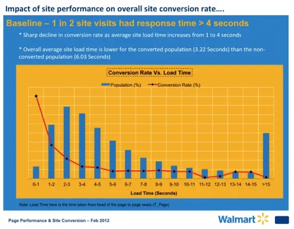
Several years ago, Amazon.com and Walmart ran page load and conversion tests, with nearly identical results.
Google came to a similar conclusion in multiple tests, which is why Google now places a premium on page load speed. Busy people browsing on mobile devices don’t have the patience for slow-loading pages.
Some factors in page load are:
- Unoptimized graphics.
- Too many decorative graphics.
- Bloated, unoptimized code.
- The fonts you choose (Adobe fonts can add over 400K to page size).
- Unoptimized server settings.
- Inadequate hosting.
Your marketing company should use a quality hosting service. Your site Should be optimized for speed.
If you have your doubts, ask them to provide you with a GTMetrix or WebPageTest page speed report and explain it to you.
Or you can run the report yourself because the services are free. The results might shock you.
Summary
If any of these problems sound familiar, it’s time to take action. Hire a reputable marketing firm that understands UX and conversion analysis and can offer compelling examples of work they’ve done.
Not every agency handles UX well, and the ones that do tend to be pricier.
Or you can call us at Culture Cube for a free website assessment. Our staff experience with conversion analysis goes back to 2006, predating Google Analytics and the iPhone.
References & Further Reading
- How website performance affects conversion rates (Cloudflare)
- Call to Action (Amazon Books)
- Don’t Make Me Think, Revisited: A Common Sense Approach to Web Usability (Amazon Books)
- The Rules for Modern Navigation (UX Booth)
- Web Copy That Sells (Amazon Books)

Peter Losh is the SEO Director of Culture Cube Marketing in Upland, California. He's also a de facto UX designer, site builder, and content creator. Unlike most folks in the SEO biz, he works directly on the sites he optimizes, having witnessed the effects of recommendations that go ignored or misunderstood (in previous gigs).
Peter has worked on websites since the salad days of the internet, first as a graphic artist and web designer at the Centers for Disease Control. Then came several years of freelance web development, SEO and e-commerce management for business sites of various sizes, and ultimately a 10-year stint as the sole SEO Manager of PartyCity.com.
In his spare time, he enjoys classic film, classical music, and classic comebacks. And cats.
Professional Work Experience
- Search engine optimization
- Ecommerce management
- Conversion rate optimization
- UX design and analysis
- Copywriting and training
- E-mail campaign design
- Web design and development
- Graphic design


