UX Case Study: A Local Newspaper

Date of Project: December 2021
Overview
The Daily Bugle (fictitious name) is a local newspaper with print and online editions. It serves a city with a large retirement community.
Traffic on the website averages between 2,000 and 3,000 visits daily. Some subscribers read the online edition exclusively.
The Problem
Subscriptions were lagging. Bugle staff endured a barrage of reader complaints about website UX (user experience).
- Internal search “didn’t work.”
- The subscription process was confusing.
- They couldn’t “find things.”
Our Analysis
Heat map tracking, Google Analytics data, and our visual analysis revealed several easily correctable UX issues contributing to reader frustration.
- Global navigation was cluttered and confusing. Nothing stood out.
- A secondary row of home page navigation added to the noise and showed little customer engagement.
- Serif fonts, chosen for branding, made navigation links difficult to read. They didn’t hold up on smaller screens.
- The internal search icon was barely visible. The text entry box vanished on a black background.
- A promotional banner offered subscription links. But most users ignore banners in a phenomenon called “banner blindness.”
- Global footer links looked identical to footer text. Users didn’t know where to click. White, center-aligned text on a jet-black background was hard on the eyes.
- The lengthy subscription form had 13 data collection fields, compared to 4 or 5 for major newspapers. This contributed to a high click-out rate, especially on mobile devices.

What We Did
- We simplified global navigation, removing the secondary bar and moving less-used links to the global footer.
- We chose a more legible sans serif font for global navigation, increased spacing and font sizes, and placed links on a neutral white background.
- We added a red “Subscribe” button in a visual hotspot of the global header.
- We made the internal search function more conspicuous and user-friendly.
- We restyled the global footer with sans serif, left-aligned links on a white background, rollover effects for links, and icons for call-outs.
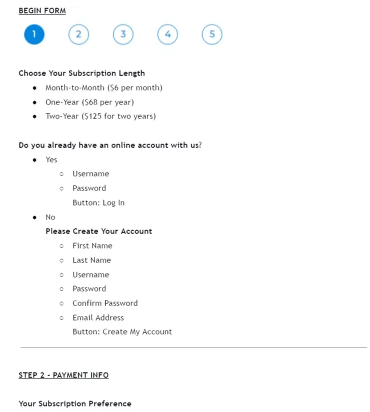
- We redesigned the subscription form as a multi-step process that collected data in digestible chunks and gave users a logical click path.
The Result
Heat maps showed far fewer “rage clicks” after the redesign and more reader engagement with the subscription link and internal search function.
Analytics verified that subscriptions had increased, and Bugle staff reported fewer reader complaints.


