The 8 Worst (& Most Common) UX Mistakes of Local Business Websites

We get it.
Local businesses don’t have massive advertising budgets.
Their website — if they have one at all — was cobbled together in a couple of days for a few hundred dollars, maybe by someone with little design experience or an agency with no UX expertise on staff.
As a result, UX suffers, sometimes grievously.
What Is UX?
UX stands for “user experience,” or how a customer experiences your website.
It includes everything from page load time (shorter is better) to the clarity and usefulness — or lack thereof — of your global navigation.
Good UX translates to lower bounces, higher conversion rates, and greater satisfaction with your site. In the best of all possible design worlds, customers won’t even notice your UX. They’ll be able to find and do what they need effortlessly.
Poor UX, on the other hand, leads to an unfavorable impression of your business and high bounce rates. Customers won’t stick around. Their mounting frustration will compel them to leave.
So without getting too deep into the weeds and attempting a book on the subject, let me point out eight of the most common UX problems plaguing local business websites. They’re the worst, in my view, because they’re so easy to avoid and correct.
1. Unclickable Icons That Look Like Links
Web designers use icons to draw attention to certain areas of a page or break up the monotony of long blocks of text.
Smart move, right?
Not if clickable navigation icons blend with purely decorative icons, and they’re so similar you can’t tell the two apart.
The result will be “rage clicks” — customers not knowing where or what to click on.
The acid test is to stand 10 feet away from a page. Your eyes should gravitate to the essential elements and messages. You should know intuitively what’s clickable and what isn’t. And if you don’t, you have a UX problem.
2. Text Links That Don’t Look Like Links
How hard is it to make a text link look like a link?
Not hard at all — browsers do it by default with the underlined blue link you still see in Google search results. Designers often relegate blue text links to oblivion because they clash with a color scheme that no customer cares about.
Some websites have:
- Colored text links without underlining. Bad idea, because 1 in 12 men have some degree of color blindness.
- Text links with no coloring or underlining at all. That’s a horrible idea.
- Clickable headings that no one knows are navigational because they look exactly like headings without links.
Text links should be obvious as links — ideally underlined — and assigned a color unused by non-navigational headings and call-outs on a page.
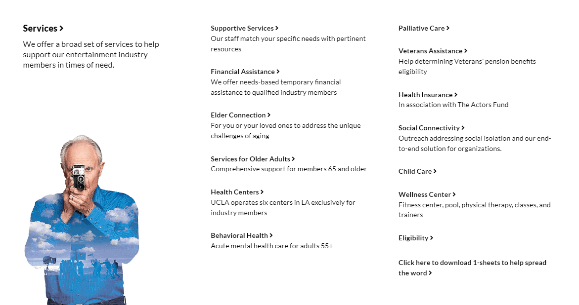
Some of this menu text is clickable, and some isn’t. Can you tell the difference?
3. Missing Menu Pages
A plumbing website may have a dropdown menu that looks something like this (minus the bullet points):
Plumbing
- Leak Detection
- Pipe Repair
- Repiping
- Water Heaters
- Faucets
- Etc.
Only when you click on “Plumbing,” nothing happens. You don’t go to a plumbing page. Instead, you see a dropdown menu with other navigation options. The top “link” (Plumbing), or what should be a link, is unclickable. It’s a cardinal UX sin, in my view.
The global navigation bar has one purpose — navigation — and every word on it should contain a link — no exceptions! “Plumbing” should lead to a menu page with information about the service and links to other pages.
Maybe the designer had legitimate reasons to take a shortcut, like a lack of content for the plumbing page. But a placeholder page with links to other pages will fill the gap until someone develops the content.
4. Missing Content Links
I read years ago that many users avoid global navigation elements, preferring to click links within the content of a page.
I witnessed it with my own eyes when a friend with a master’s degree struggled with the global navigation I had carefully crafted. She was looking for a link within the page.
I’m guessing that in the age of the mobile phone, users rely more than ever on content links to get around.
So don’t assume that your global navigation menu takes care of everyone equally well.
Give users multiple ways to navigate your site — in global navigation, page content, and your global footer.
5. Menu Pages That Don’t Look or Act the Part
How often have you clicked on a link to “Services,” only to see a long and dull article-like exposition? Is there a link anywhere to the one service that interests you?
Yes, but it’s several paragraphs down in an element that doesn’t even look like a link.
When a designer fails to grasp what a menu page is for, or understand that any page with subpages is automatically a menu page, it can look like an article, confusing and frustrating users.
Every menu page should include a clear, concise summary of services, followed by prominent links to deeper information.
If your page has article-like content for SEO, place it well below the link call-outs. On a menu page, the links are the message. Make them easy to spot.
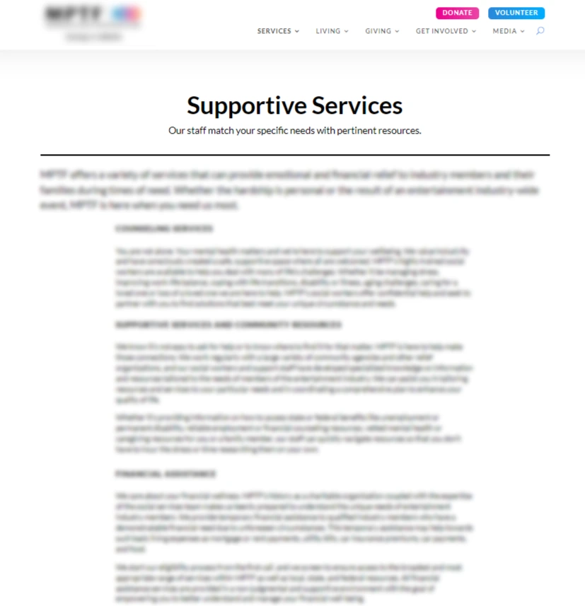
This menu page looks like an article. Links to services are placed below a huge block of copy.
6. Poorly Designed Contact Pages & Forms
Contact forms are almost an afterthought on many local business sites, assigned to a harried developer who carries forward the clunky form of the old site and only gives it a fresh coat of paint.
That contact page is the second most important for a local site, after only the home page.
Visual clutter, unclear and misplaced labels, and invasive and unnecessary form fields will lead to form abandonment.
But also, does the contact page offer assurances? Mentions of discounts for seniors and members of the military? Should the form be to the right or left of contact information? In other words, what should mobile users see first?
These questions should be addressed during the design phase.
For more on the contact page and its barriers to conversion, please read our blog on contact page mistakes.
7. Hidden Links to Service Area Information
I take it back. The service area page is the second most important page on a local business site!
Whatever the rank, it’s critical for customers searching for a plumber to know the plumber’s service area.
Yet how often do we see links to the service area page buried in a site’s footer, and not displayed in the global navigation bar?
Users instinctively look to the global navigation bar before they scan a page. Make sure it contains links to all of your most important pages.
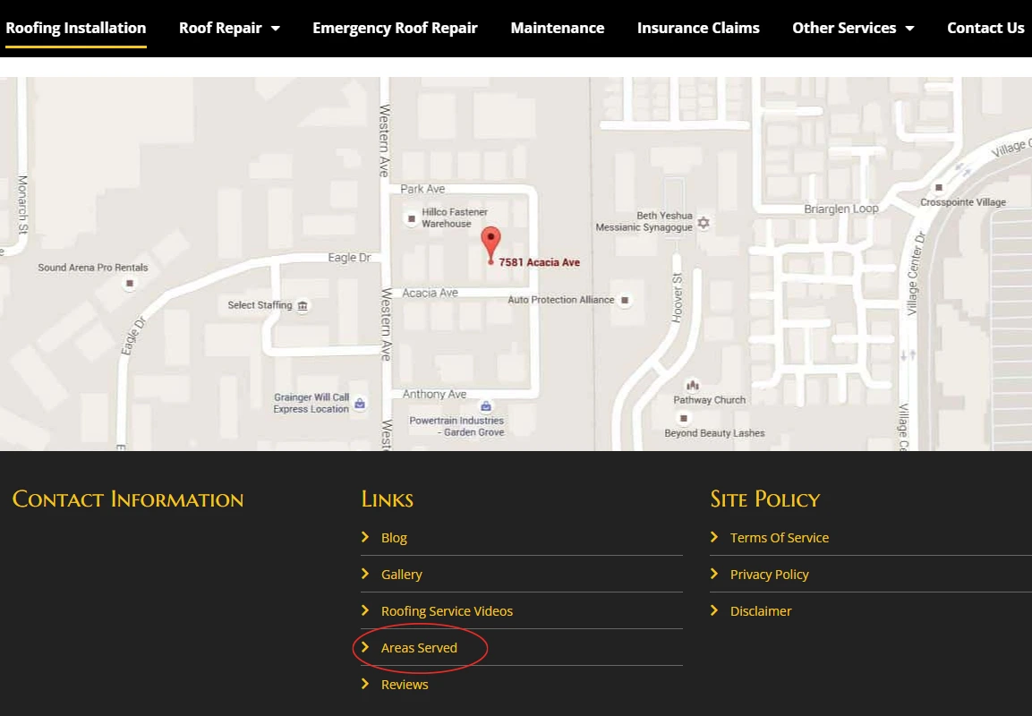
Where o where is the service area information for this local site? Not in global navigation, where it should be, but at the bottom of the page, below the big honkin’ map no one scrolls to see.
8. Missing Calls to Action
The purpose of a website is to get people to do something — click, buy, subscribe, fill out a form, etc. A call to action (CTA) provides a link or button encouraging users to act.
On a plumber’s website, this could mean signing up for service, requesting an estimate, or scheduling an appointment.
CTAs should be prominent and consistent throughout the site — not just on the home page. Many sites lack CTAs on interior pages, meaning users must click back to the home page or scroll to the contact link in global navigation to take action.
Every page should contain at least one CTA button or link. It should stand out from other elements on the page and communicate what it will do when clicked.
About Culture Cube Digital Marketing
Culture Cube specializes in digital marketing for local businesses. Our clients include plumbers, HVAC installers, appliance repair companies, and local newspapers.
We offer the expertise of a large agency at small agency rates.
Because we specialize, we’re better qualified to promote your small business and create the most effective campaigns.
We don’t waste client money on lavish offices, fancy equipment, costly business trips, and endless meetings. We pass our savings on to you and welcome you as a partner more than a client.
Please contact us to learn what we can do for you.

Peter Losh is the SEO Director of Culture Cube Marketing in Upland, California. He's also a de facto UX designer, site builder, and content creator. Unlike most folks in the SEO biz, he works directly on the sites he optimizes, having witnessed the effects of recommendations that go ignored or misunderstood (in previous gigs).
Peter has worked on websites since the salad days of the internet, first as a graphic artist and web designer at the Centers for Disease Control. Then came several years of freelance web development, SEO and e-commerce management for business sites of various sizes, and ultimately a 10-year stint as the sole SEO Manager of PartyCity.com.
In his spare time, he enjoys classic film, classical music, and classic comebacks. And cats.
Professional Work Experience
- Search engine optimization
- Ecommerce management
- Conversion rate optimization
- UX design and analysis
- Copywriting and training
- E-mail campaign design
- Web design and development
- Graphic design


