UX for E-Commerce Dummies: Always Test Your Assumptions
What Works for the Stores May Not Work Online
E-commerce is the red-headed stepchild of brick and mortar, or almost an afterthought. Some brick-and-mortar chains run their website like a 24-7 retail store.
“How is that even possible?” you may wonder. “The two things are so different!”
Shoppers intuitively know this, but the lesson can be lost on decision-makers in the C-suites.
Thus it was when I worked in e-commerce for a company with 850-plus retail locations across the USA.
Brick and mortar came first. It dominated all discussions and strategy.
- Website inventory followed a brick-and-mortar schedule, even though online shoppers buy much earlier for a season.
- Category pages mimicked the planogram, even though online shoppers browse products far more than categories. A planogram, for your reference, is “a diagram or model that indicates the placement of retail products on shelves in order to maximize sales” (Oxford Dictionary).
- Duplicate categories appeared everywhere, like endcaps in a store.
- Product copy was ignored. A photo was all the customers needed! Imagery got first-class treatment while information traveled in cramped steerage.
Rarely did the C-suite executives test their assumptions. They often doubled down on failed campaigns, making matters worse. Worst of all, they never took UX seriously.
What Is UX?
UX means “user experience” or how someone feels about your website.
- It starts with the initial page load. Fast-loading pages help create a positive experience.
- From there, it goes to navigation. Are there too many options in the navigation bar? Is it obvious what’s clickable and what isn’t?
- Can visitors find what they’re looking for? Can they find what they want from the site search option?
- Is information clear and free of jargon?
- Are products displayed in a logical order, or are categories a mess?
- Do product pages have useful cross-sells?
- Are out-of-stock products marked as such?
Bad UX is the bane of ecommerce and conversion. And the closer it occurs to a transaction point, the deadlier it can be.
Assumption #1: Customers Shop by Category or Collection
Customers may start in categories but quickly abandon them in favor of attributes like color, size, or price once they click into a product page.
This point was lost on company brass, who ignored product pages in favor of carefully curated category “collections.” Product pages were neglected to the point where some had only two lines of copy, and no cross-sells.
So I conducted a test.
- I chose 200 poorly selling candy SKUs that had been on the site for at least a year.
- I rewrote the copy, including important details and making the candy seem palatable.
- I added at least four relevant cross-sells to every SKU.
Within two weeks, sales had improved by 40%, and the number kept rising until many SKUs sold out.
The takeaway: Categories are essential for navigation, organization, and SEO, but they aren’t the primary means of finding products.
De-emphasize categories in favor of internal search, filtering, and robust product pages with highly relevant cross-sells.
Assumption #2: Decorative Photos Inspire Customers to Buy
Jakob Nielsen, the godfather of digital UX, rails against purely decorative images.
“Some types of pictures are completely ignored. This is typically the case for big feel-good images that are purely decorative.”
Source: Photos as Web Content
Yet my company, less interested in Jakob Nielsen than their own experience with window displays, invested heavily in “family pages,” affectionately known as “money pages” because they generated so much income.
Each family page featured an “inspirational” hero image at the top, sometimes as many as five, which could add two seconds or more to page load time.
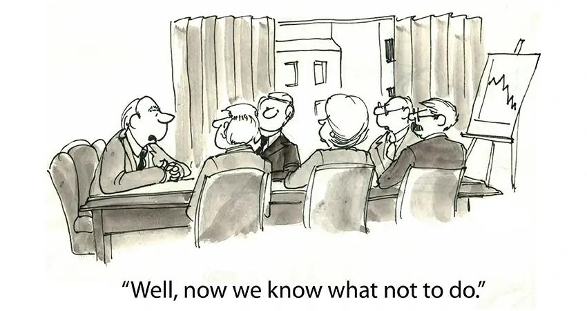
After nine years and facing costly platform customization, the company ran an A/B test: one set of pages with hero images and one without.
The pages without converted better by a wide margin. The company had wasted millions of dollars on a fundamentally flawed marketing approach.
The takeaway: Don’t assume that customers embrace the features you love. Features are helpful only when they contribute to the desired outcome.
Assumption #3: The More You Show, the More They’ll Buy
A fact of life in a retail store is that nothing sells unless it’s on display. And the more you display an item — in endcaps, near the register, or in a prime shelf space — the more it tends to sell. The same principle should apply to e-commerce, right?
Wrong.
Cluttered pages and overcrowded navigation quickly overwhelm even the most determined e-commerce shoppers, who’ll take their business to another, better-organized website.
Several times during my tenure, we decommissioned duplicate pages and even entire duplicate sections of the website. In every case, sales increased as a result.
The same held for navigation. The more we curated the links, eliminating duplicates and links to lower-value categories, the more we sold.
The takeaway: When in doubt, leave it out. Beyond a point, the more you show, the less they’ll buy.
Assumption #4: Online Sales Mirror Brick-and-Mortar Seasonality
Once, the vice president asked me: Given the power to do anything, how would I boost seasonal sales?
For me, the answer was obvious. Identify the top-selling SKUs for the season, stock them earlier, and stock more of them.
Time and again, I’d seen the top SKU for luau parties sell out in July, whereas luau sales continued year-round. Once a product sold out, it couldn’t be restocked for several months.
Website analytics showed that customers online bought much earlier for a season and sometimes much later. Santa suits began selling in October. Large orders of Easter baskets could occur in December.
We identified top SKUs that had sold out early and doubled or tripled our stock for the coming year. Unsurprisingly, sales went up.
The takeaway: Have products available when customers are ready to buy, not when you think they should buy.
Assumption #5: All Products Are More or Less Equal
According to the Pareto Principle, 20% of employees shoulder 80% of the responsibility at work. 80% of sales come from 20% of your customers.
I’d take it one step further because, as far as I could tell, only 20% of our products generated 80% of the revenue.
I always argued that these products should get first-class treatment:
- Better product copy
- Better cross-sells
- Featured placement in categories
Unfortunately, in the cattle call leading up to a season, overwhelmed merchants and copywriters never gave them the attention they deserved. In most cases, we’d upgrade copy and cross-sells for the “winners” well into the season, which was better than nothing, but far from optimal for sales.
The takeaway: Focus your attention and resources on the products (and things) that matter most. If you don’t know what those are, take time to figure it out.
Assumption #6: The More Traffic, the More Sales
Site traffic is always top of mind in e-commerce. More traffic means more sales, right?
Uh, no.
Traffic is only part of the equation. You could have millions of visitors to your website, but if few of them buy anything, your business won’t succeed.
The key is to focus on traffic that converts — that is, traffic that leads to sales.
There are many ways to increase conversion rates, such as:
- Offering free shipping
- Having a user-friendly website
- Improving page load times
- Writing compelling product copy
The takeaway: Prioritize UX and conversions, and you’ll see your sales go up — even if your traffic stays the same.
Conclusion
E-commerce is a different species from brick-and-mortar, and customer behavior follows a different set of rules.
Often, what works in a retail setting won’t work online — and vice versa. By understanding and challenging your assumptions, you can help your e-commerce business succeed.
Are there any other e-commerce assumptions that you challenge? Let us know in the comments!

Peter Losh is the SEO Director of Culture Cube Marketing in Upland, California. He's also a de facto UX designer, site builder, and content creator. Unlike most folks in the SEO biz, he works directly on the sites he optimizes, having witnessed the effects of recommendations that go ignored or misunderstood (in previous gigs).
Peter has worked on websites since the salad days of the internet, first as a graphic artist and web designer at the Centers for Disease Control. Then came several years of freelance web development, SEO and e-commerce management for business sites of various sizes, and ultimately a 10-year stint as the sole SEO Manager of PartyCity.com.
In his spare time, he enjoys classic film, classical music, and classic comebacks. And cats.
Professional Work Experience
- Search engine optimization
- Ecommerce management
- Conversion rate optimization
- UX design and analysis
- Copywriting and training
- E-mail campaign design
- Web design and development
- Graphic design


