Web Design & The Paradox of Choice: How They Affect Your Business

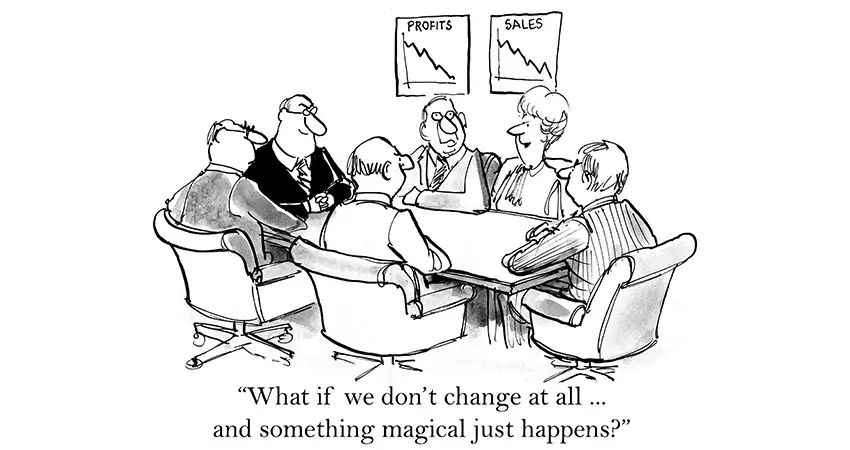
Back in the day, I worked in the ecommerce division of a major retailer. Officially, I managed SEO — search engine optimization. Unofficially, I offered usability (UX) and conversion advice. It was usually ignored, especially when it conflicted with the beliefs of the folks in the C-suites.
Most C-suit execs had loads of brick-and-mortar experience but little ecommerce know-how. They treated the website like a brick-and-mortar franchise, where you put everything on display according to a planogram.
That’s how customers shop in a store: they browse all the aisles until they find what they need. They pick up dozens of things they don’t need along the way. The trouble is, no one shops that way online. The average session lasts 2 to 3 minutes — less time than it takes to find a parking spot at Costco.
The Paradox of Choice
In 2000, two university psychologists published the findings of their experiment. They had set up a table for jam sales in a food market.
On day 1, they featured 24 flavors of jam. On day 2, they offered only 6.
On day 1, with 24 choices:
- 60% of shoppers approached the table
- Shoppers sampled 2 flavors on average
- 3% of shoppers bought jam
On day 2, with 24 choices:
- 40% of shoppers approached the table
- Shoppers sampled 2 flavors on average
- 30% of shoppers bought jam
That’s the paradox. Faced with too many choices, shoppers bought less, not more, and they bought less by a wide margin.
Simplicity Is the BFF of Conversion
KISS — “keep it simple, stupid.” How many times have we heard it? Which microwave in the breakroom do you prefer — the one with a dial timer or the space-age unit you need a manual to operate?
Sure, the fancy microwave does more, but who cares when you’re just reheating a burrito on your 30-minute lunch break? Simplicity often produces the best results, not just in jam displays and microwaves but also in UX and web design.
The more you force prospects to think, especially about trivial things, the less likely they will buy, call you, or follow through with an action that counts as a “conversion.”
A frustrated website visitor won’t stick around to decipher your global navigation mega menu, cluttered pages, and confusing messages. That visitor will be gone, lickety-split. Therefore, keep it simple.
- Don’t list every possible link in your global navigation. Most users can hold about 7 items in memory. Show only the stuff that matters most.
- Keep pages focused and clear. Unfocused pages don’t help anyone or anything, least of all your business.
- Limit decorative elements on a page, especially if they slow page load times or look like navigation elements but aren’t.
- Choose your words carefully. The average person reads at an 8th-grade level. Use language that communicates instead of $10 words to impress.
- Give shoppers everything they need to know about a product or service, but not so much that they’re overwhelmed. The trick is to highlight what matters most and answer any potential objections that may pose a barrier to sales.
Less Is More: Real-World Examples
Pruning Navigation
Let’s return to the aforementioned ecommerce site. In the navigation header, merchants tirelessly promoted the categories they managed, even the small-fry.
There was no holistic planning or UX oversight. Global navigation grew to an astounding 850+ links, confounding customers and hampering SEO.
Some categories on the site had 3 or 4 global links pointing to them. The navigation boasted no fewer than 30 links to nearly identical candy buffet categories.
It was a prime example of brick-and-mortar thinking. “If you show it, they will buy.” Only they didn’t.
Finally, after many years of nagging, SEO prevailed upon the merchants to trim global navigation by 2/3. There were still far too many links, but no duplicates. Links that failed to engage were removed.
Sales improved, and bounce rates decreased. By showing less, we sold more.
Deleting Duplicate Categories: Mardi Gras
Merchants couldn’t decide if Mardi Gras was a holiday or a theme. Their brick-and-mortar solution was to place identical Mardi Gras party supplies under Holidays and Themes. It made perfect sense if you came from a world of endcap displays.
Except that Mardi Gras performed worse than other holidays and themes. Sales were lackluster. The duplicate categories dragged down SEO; the site couldn’t rank for high-volume Mardi Gras keywords.
Worse, Mardi Gras had to be maintained in two areas of the site, wasting limited human resources. But SEO prevailed upon the merchants yet again.
We killed the duplicate theme, and lo and behold, the site began to rank for Mardi Gras keywords. Sales shot up, and Mardi Gras became a star holiday performer. Customers had been searching Google for Mardi Gras, not browsing the site for it. We attracted shoppers only when we gave pages a chance to rank.
Deleting Duplicate Categories: Tableware
The site also featured two categories on the main menu side by side: Tableware and Shop by Color. They contained the very same products, albeit in slightly different subcategories. Sales were sagging.
Merchants couldn’t keep up with the demands of maintaining two large, highly similar categories.
But tableware was the #1 product line on the site. Merchants worried that removing one of the top-level categories would hurt sales.
Eventually, we removed Shop by Color, consolidated Tableware’s subcategories, optimized the menu page, and created several new subcategories.
Sales rose immediately and dramatically. Quelle surprise. The side-by-side presentation of nearly identical categories had confused customers. Confusion is the bane of conversion.
Simplifying the Mega-Page
The so-called “family page” was a favorite with the company brass. It presented a themed collection of products, like Mickey Mouse party supplies. Executives revered it as “the money page” and were so enamored they pushed every conceivable collection to a family format.
My job kept me close to the data, and I argued that the page was a disaster:
- Brutal for SEO — the worst-performing template on the site by far.
- Slow-loading — up to 20 seconds on average for some families.
- Time-consuming to build and maintain.
Among the selling points of the template, in the view of executives, were giant “inspirational” hero images at the top of the page. A hero image could take several hours to complete; some families featured 5 of them in a slideshow.
I asked for an A/B test to determine if hero images really did inspire customers to buy. And after after 9 short years, I got my wish. We tested the sales of family pages with hero images and without. Nothing else changed, but the pages without hero images:
- Loaded faster
- Displayed top-selling products above the fold
The pages without heroes sold more. A lot more. The family pages had been generating revenue due to the popularity of the products they sold and not the inspirational presentation. Sales ticked up when we followed ecommerce best practices and:
- Converted families to shorter and faster-loading categories;
- Removed decorative hero images;
- Limited the products shown to customers;
Over the years, the company had invested millions of dollars in a template and concept that actually retarded sales.
Reducing the Ever-Expanding Local Navigation Bar
Within the site were dozens of holiday and theme microsites, some of which contained over 50 subcategories. Imagine my consternation, then, when some local navigation bars exploded to 50+ links.
Yes — true story — imagine negotiating a left navigation menu so long it extended below the fold into perpetuity. And all you wanted was a cheap Santa suit.
Here again, I brought analytics and click data to meetings and showed the merchants how little revenue some categories produced.
We deleted low-value categories, consolidated others, and created lower-level menu pages with subcategories for themed content.
Once again, revenue rose when we introduced a logical structure, leaner local navigation, and fewer links.
Conclusion
The paradox of choice affects your business in ways you may not realize. Customers shut down when you give them too many options.
On a small business website, barriers to conversion can include:
- A busy home page.
- A badly designed contact form.
- Unclear marketing messages and value propositions.
- Cluttered global navigation.
- Unclear click paths.
Please call us to learn more. We’ll assess your site for free and devise an affordable plan to simplify, clarify, and increase your conversions.
Further Reading
- Simplicity Wins over Abundance of Choice (Nielsen Norman Group)
- The Magical Number 7 & UX (Nielsen Norman Group)
- The Paradox of Choice: Do More Options Really Tank Conversions? (CXL)

Peter Losh is the SEO Director of Culture Cube Marketing in Upland, California. He's also a de facto UX designer, site builder, and content creator. Unlike most folks in the SEO biz, he works directly on the sites he optimizes, having witnessed the effects of recommendations that go ignored or misunderstood (in previous gigs).
Peter has worked on websites since the salad days of the internet, first as a graphic artist and web designer at the Centers for Disease Control. Then came several years of freelance web development, SEO and e-commerce management for business sites of various sizes, and ultimately a 10-year stint as the sole SEO Manager of PartyCity.com.
In his spare time, he enjoys classic film, classical music, and classic comebacks. And cats.
Professional Work Experience
- Search engine optimization
- Ecommerce management
- Conversion rate optimization
- UX design and analysis
- Copywriting and training
- E-mail campaign design
- Web design and development
- Graphic design


